

KTPconTeyor, a global player in packaging, offers a wide range of products and services for a variety of industries (smart reusable packaging and sustainable storage solutions).
Their products save space, cut transport costs and lower the total cost of ownership, while reducing CO2 emissions.
Shortly before acquiring KTP and changing its name to KTPconTeyor, conTeyor had gone through a rebranding and adopted new logos for its group.
Briefing
Design new logos for the 4 divisions of the conTeyor group to make the new structure clearer and easier to integrate, so that the Storeganizer subsidiary fits in visually.
Key points to take into account in the design:
- Use the existing logo as the basis for the new logos.
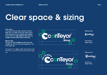
- Add the word "Group" to the logos to show that this is a group with divisions.
- The design must be consistent with conTeyor's visual identity.
The new logos must have a strong visual identity that fits the conTeyor group.
It is essential that the new logos stand out clearly from the existing conTeyor logo, while showing that they belong to the same group.
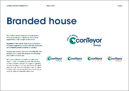
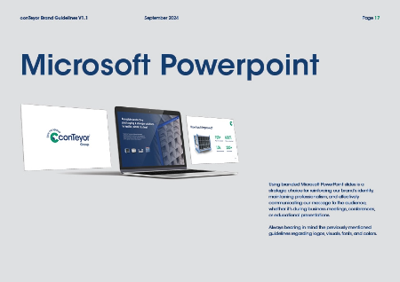
Create a new visual identity (guidelines).
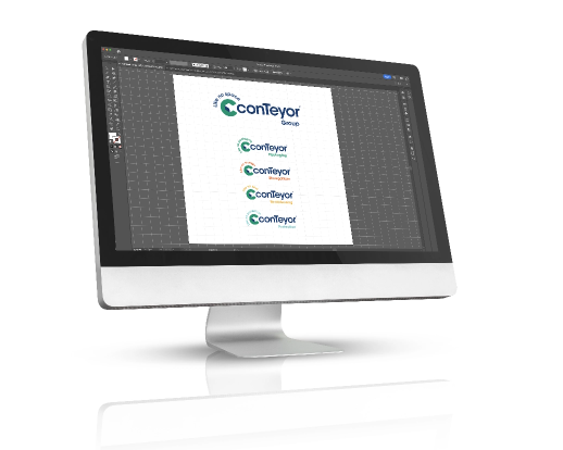
What we did:
- (Re)branding of the logo
- A "Group" logo and variants for the divisions
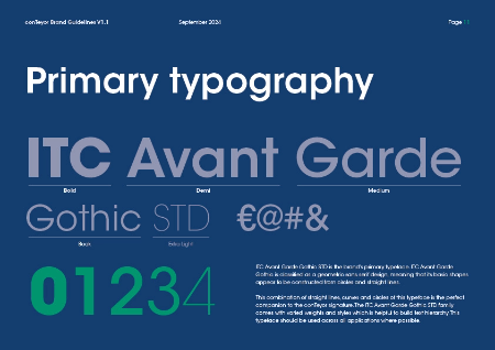
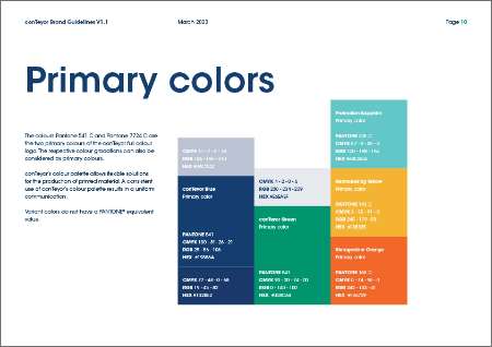
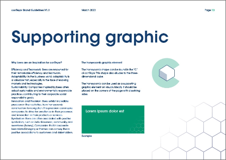
- A new visual identity
- A quick website update (web publishing) pending a new site
- A video presenting the rebranding
- An update of all marketing documents
Key takeaways
Thanks to a clear strategic vision and excellent collaboration with conTeyor's marketing department, the rebranding and the integration of Storeganizer as a division of the conTeyor group were a success.
The new brand identity fits seamlessly with the existing branding.
This was made possible by our branding expertise.

 Want similar results?