
PROCERTUS: background and objectives
When BE-CERT, PROBETON and OCAB-OCBS merged into a new organisation, we took on the challenge of creating a brand identity that would reflect not only the combined strengths of these organisations, but also their forward-looking vision.
Our main objectives were to consolidate their positions in their respective markets and to prepare the new entity to lead the renewal of the certification landscape in Belgium, with a particular focus on sustainability.
Strategic preparation and situation analysis
Before starting the creative phase, we carried out an in-depth analysis to define the positioning, vision, mission and values of the new organisation that would soon become Procertus. This crucial step identified the core activities, target audiences and current market perception, laying the foundations for positioning PROCERTUS among the leading certification bodies in Belgium.
Developing the new brand identity
Drawing on the strategic insights, we proposed several possible names that met the following 10 criteria:
- Not too complicated
- Not too general
- A possible wink to the service
- Pronounceable
- No bad connotation
- Emotional response
- Appeal to the imagination
- Flag for the entire organisation
- Legal aspect, intellectual property (to be checked with a lawyer)
- Website registration
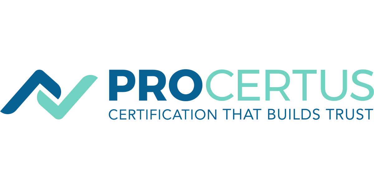
Of these names, "PROCERTUS" was chosen because it embodies professionalism, leadership and collaboration in the certification sector.
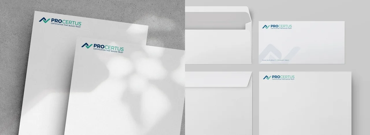
We developed a distinctive, professional visual identity, including the logo and a strong tagline, complemented by the brand's other elements (the branding).
The brand's visual identity guidelines will allow the new entity to roll out its identity consistently.
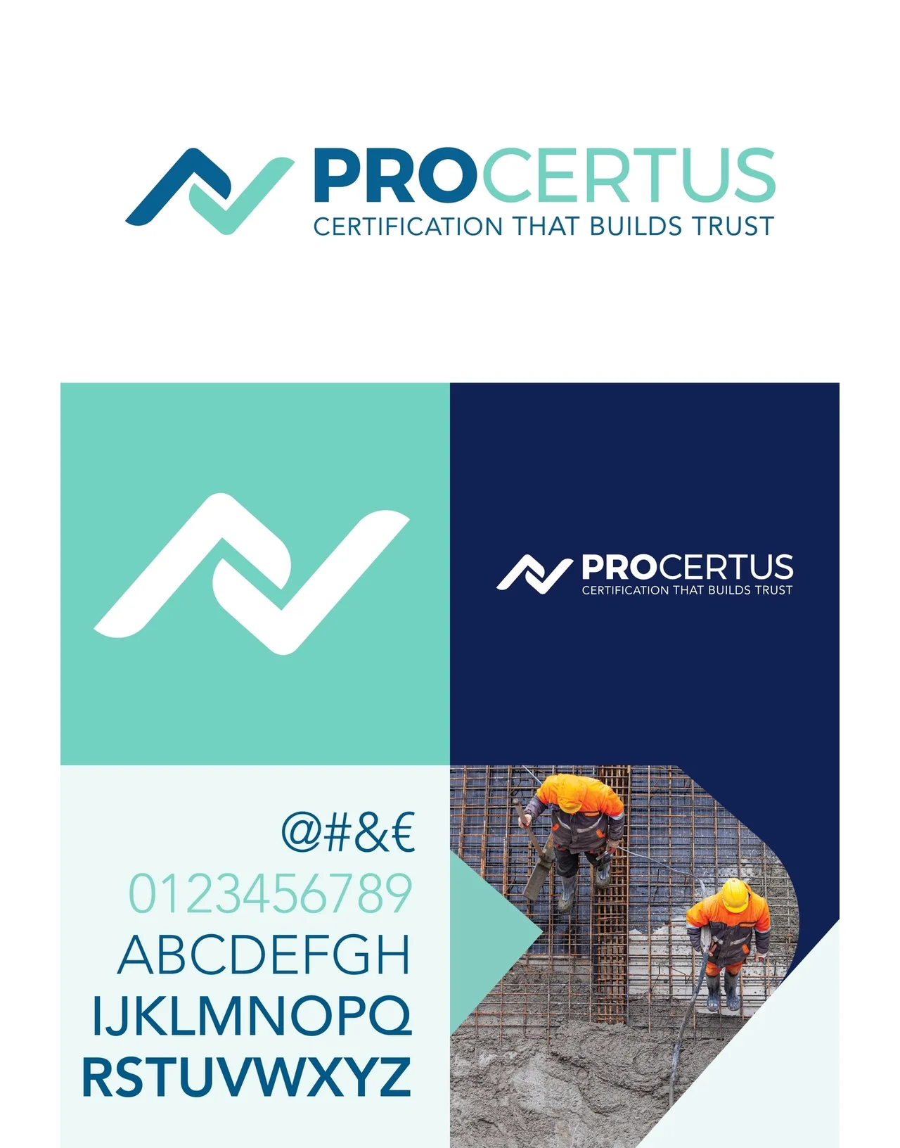

CERTIFICATION THAT BUILDS TRUST
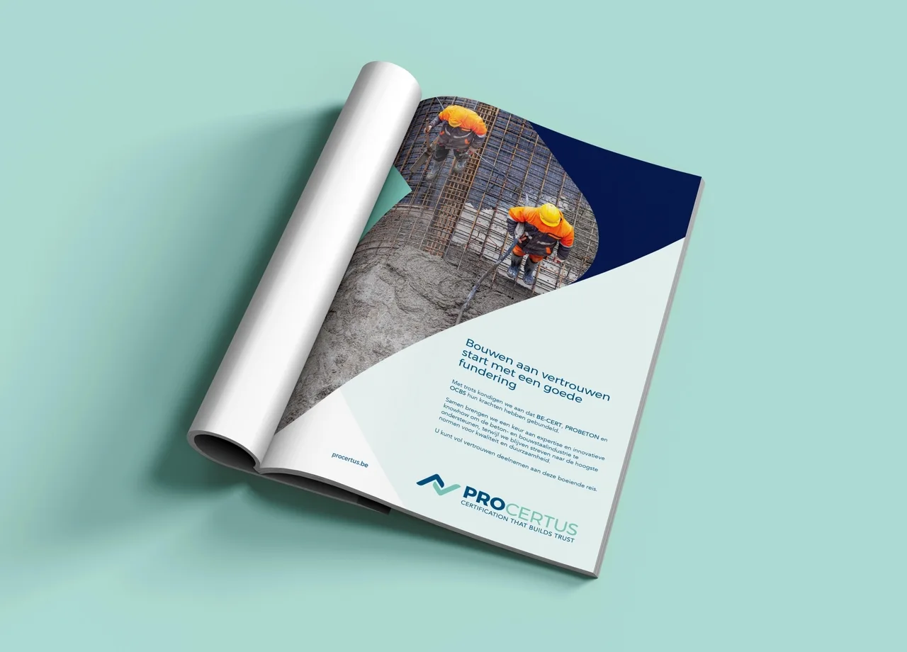

Launch and communication
We also defined the content pillars and relevant topics to strengthen the brand identity, with the aim of giving the communication actions a clear structure.
- Objective: make communication actions objective and measurable.
- Benefit: they form a pool of content to draw on in the communication plan.
The chosen topics need to be strong enough to work independently of the format (website, social media, ads, brochure, newsletter, etc.).
These elements form the foundation of a coherent communication plan, including editorial guidelines and a suitable tone of voice, to ensure a consistent presence across every communication channel.
Results and future vision
The launch of the PROCERTUS brand in April marked the start of a new era for the company, now positioned as one of the four leading certification bodies in Belgium's construction and concrete sector, with a strong focus on sustainability and quality.
Would you also like to transform your brand to better meet the challenges of your market?
Contact us now to discuss your project with one of our branding and marketing experts.

 Want similar results?